Category Archives: Websites

Market Your Business by Submitting to Online Directories

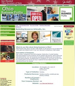
Ohio_Business_ProfileDuring the month of May, my marketing company - Marketing Resources & Results - is profiled by the State of Ohio.

The state is focusing on successful women owned businesses this month.

I’m honored that my company was one of the businesses selected to be profiled.

So, how did we get selected? Just like so many things in business, we were prepared and kept our eyes open for opportunity!

Are you prepared to market your company? Do you have your summary statement? 4 photos that represent the business? Do you know where to look for an online directory that makes sense for your business?

The state of Ohio takes submissions for their directory of businesses.

Besides the state level, there are lots of potential directories that may be interested in profiling your business:
Yelp, DMOZ, City-Data, Thomas Register, and more.

It’s important to use only legitimate directories, not link farms that charge you for listing your domain.

I’m assuming you know why it is important to have online visibilty for your company. If you’re not seen on line, in many cases, your business simply doesn’t exist.

So, where do you have your company profiled? Share the link below in comments.

13 Ways to Improve Landing Page Conversion Rates Today

Guest Author Jason Wells is the CEO of ContactPoint.

One of the best ways to get a lead is to create a landing page. Landing pages can offer anything from a coupon or a White Paper to a Demo or an actual product.

While keeping in mind that no landing page is perfect, there are a few simple ways you can improve landing page conversion rates today.

1. Goal – When you create a landing page what is your goal? What is the purpose of your landing page? Do you want people to download a White Paper, schedule a demo, or call you on the phone? Do you want them to buy something? This goal should be clearly defined and obvious to the visitor at-a-glance. Everything on that landing page should work to accomplish that goal.

2. Headline – The headline of your landing page needs to be clear and concise. That is all.

3. Crisp Copy –There is a rule that journalists use that marketers should also follow. The rule is this: use the fewest words necessary to make your point.

4. Call-to-Action – Make it crystal clear. What do you want a visitor to do on your landing page? (Remember what we said about goals a moment ago).

5. Form Fields – Have you ever been to a landing page that asks for everything from the name of your dog to your mother’s maiden name. They want to know how big your business is, how many people work there and if you like pretzels. The other day I visited a landing page that had 14 fields to fill out. 14! With forms, shorter is always better. Now, there is no perfect number for form fields. But one thing is certain: 14 is way too many.

6. Forms Placement – Forms on the right side of the page have a 5% to 10% higher conversion rate than forms on the left side. Place text on the left side and place the form on the right side.

7. Buttons – Green Call-to-Action buttons convert 21% more than red buttons. It sounds dumb. But 21% is not dumb.

8. FREE – Using the word FREE in the offer or having a badge or button that says FREE increases conversion rates from 4% to 10%

9. Arrow – Using an arrow pointing toward the form or the sign up button increases conversion rates by up to 20%

10. Give Them a Deal – Promoting that you’re giving a discount will increase conversion rate.

11. Time Window – Using a specific time frame in the text increases the conversion rates of your landing page by 5% to 10%. A good example is to say ‘Sign up in less than 60 seconds’ instead of saying ‘Sign Up.’ Or, ‘ Sign up for a 15 minute demo’ instead of ‘Sign up for Demo.’ Using time sensitive wording adds some urgency to the offer and it gives them an idea of how long the process will take.

12. ‘Retreat’ Offers – If someone doesn’t want to sign up for a demo on your landing page, for example, give them the option to download a White Paper when they leave. Or if someone doesn’t want to buy something, let them sign up for your newsletter before they go.

13. Phone Numbers – When you create a landing page you need to put a unique toll free phone numbers on it to track how many calls the page generates. The landing page produces calls and the majority of these calls result in closed deals. Phone lead-to-customer conversion rates are 15 – 20 times higher than web leads-to-conversion rates.

Of all these ideas for improving conversion, I feel the most strongly that you should put phone numbers on your landing pages. You’ll get a better idea of what that landing page’s actual conversion rate is (if you don’t track calls you won’t know), and it will give people another and better option than just filling out a form.


 Jason Wells is the CEO of ContactPoint. Their new product, LogMyCalls, represents the next generation of intelligent call tracking and marketing automation. Prior to joining ContactPoint, Jason served as the Senior Vice President of Sony International, where he led the creation and international expansion of Sony’s mobile business line from London.

Jason has spoken on marketing topics at SES New York, SES Toronto, Ad Tech, Digital Hollywood, Nokia World, CTIA and elsewhere. He holds an MBA from the Wharton School at the University of Pennsylvania. To read more about LogMyCalls, add LogMyCalls to your Google+ circles or follow them on Twitter.
Website Marketing Conversion Tip: That Smiling Face in the Photo May Be Killing Your Conversion

Do you have a friendly face starring out at from your website?  You know, a fresh faced group of young people smiling with a ready to serve you look?

It may be killing your conversion.  Using a photo of a person forces the viewer to look at the person, but does not necessarily help the viewer to click thru to the next step in your sales process.

You would be better served with a button and an arrow that let’s the viewer know what the next step they should take.

Conversion Scientist Brian Massey suggests web designers should induce conversations by:

Use big buttons that call people to action. Draw boxes around important points you want to make. Strike stock photography from the site. Add a video. Shorten your signup form. Add trust symbols and logos to your pages and shopping carts. Most importantly, know the person who typed in the page URL or search term, and why they did so at this point in their life. Then make them glad they did.

Not sure what he’s talking about? Here are 10 examples of what companies are doing right (or could improve on) with landing pages. For example:

  • Change the word on a button from SUBMIT to REGISTER.
  • Use benefit words on your call to action link like LEARN HOW or FIND OUT HOW…
  • Consider using one of these 60 call to action phrase suggestions.

I challenge you to take a look at each of your websites to identify what call to action tweaks you can make to improve conversion.

Share your success —  What change did you make to your site to get more click thru’s? Leave a comment below.

Get Found in the Google Search Engine: A Website Owner’s SEO Checklist

As a marketing professional, you probably already know if you want to be found in the search engines - and especially Google — there are several SEO steps that you need to take.

Do you know the steps?

Here’s a quick Search Engine Optimization article from Future-Ink.com that could serve as a checklist of the minimum you should have as part of an SEO program.

Marketing and Blogging Tips I Learned at the Akron Bloggers Community Meetings

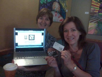
Ivana and Deborah with their Tags

Last month at the Akron Bloggers Community meeting Deborah Shapiro explained about marketing with tags

Maybe you’ve heard or seen them?  Seems like a great tool for a business to drive traffic to a specific URL link. I know they are all the rage in Japan.

Here’s one way how tags can work to market your business: Deborah Shapiro from Montrose Video has her tag printed on the back of her business card. She passes out the business card at a trade show. People with the app on their cell phone hover over the tag. It takes them to a website on their phone.

How Tags work with the Phone

Here’s a photo of Ivana Taylor with her cell phone hovering over tag on the computer screen. She opens the app on her phone (that she downloaded from GetTag.mobi) and uses her cell phone to “look” at the tag. Then the cell phone immediately moves to a website page… like a video or a photo or even a map to give you directions to get there.

You can have the tag on a sign, a business card, your tradeshow booth, etc. Downside: only on iPhones, not Blackberry or Droid yet. This is just one of the things I learned at the ABC group… but there are many things:

Some of the things I’ve Learned from the Akron Bloggers Community

  1. Blogging doesn’t have to be a solo activity.
  2. Getting together with a group of like minded individuals helps me focus my thoughts and develop my projects faster, better and with much more fun.
  3. Everyone has an “off” day, but repetition, doing something every day, or every week has a pay off. Like the saying “Luck is where preparation and opportunity meet.”
  4. Things keep changing and NO one knows it all… I learn just as much from the new members as the experienced members!
  5. The biggest challenge of blogging is the technology and getting together with a group helps to minimize the frustration!

Thought from other Akron Bloggers Community members

Note to the ABC group: I’ll keep updating this post with your article as you post it. Let everyone know by posting your link on our LinkedIn group under the discussion called “5 things I learned…