 Creating a brand involves clarity and consistency. Knowing what you stand for and having a clear message to your market.
I’ve compared a logo to a face of a brand name. Color is another important attribute for a brand. Certain colors evoke a feeling and we even use them in language:
- In the RED
- Going Green
- Feeling Blue
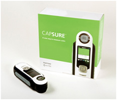
If a certain color is really important to what you stand for, you may want to consider using this new tool called CAPSURE from Pantone that exactly matches the color of an object and then tells you what color that is out of a possible 8,000 colors. It’s pricy at $649 so I imagine only those in the industry will purchase it, but would make sense in terms of time saved when the exact color is an issue.
Creating your logo with a key color and holding the color is important but can be difficult across all the platforms like the web, printing and advertising specialties. It’s even harder to hold if you describe your logo in terms of “green and yellow”.
Do you have Pantone PMS color numbers for your brand? They are the colors that graphic designers and printers use to match a specific color. Do you know the six digit HTTP alpha number for your colors on the web? This is the information you’ll need to keep your website, blog and all your social media delivering the same visual message.
Capturing this information in one place and holding true to it is the beginning of a style guide for your brand. Take a minute and jot down that bit of information (the main colors and the accent colors) for your branding guidelines and file it with the rest of your marketing plan.
Full Disclosure: I haven’t tried this product, nor have I received any money or freebies in exchange for this post. I just think that the concept is interesting and could save some time and money when the client is trying to match a very exact color! If you’ve used a product like this, leave a comment and let me know your thoughts.
I love the concept of the colors. Great thoughts.