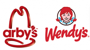
 Both Arby’s logo and Wendy’s logo have had a recent update.
I’m interested in this because we are in the midst of helping one of our clients move from the logo they’ve had for years to update and refresh their logo into a rebranded version of their company.
While we’ve driven the rebranding of several small businesses, I really enjoy seeing what the “big” guys do when it’s time to update a logo to match the positioning of a brand.
I’d love to be a fly on the wall in these conference rooms at these fast food companies to overhear what the marketing departments considered before making the update.
What do you think was their logo refresh direction to the graphic designers?
Here’s my take on it:
Arby’s is trying to change it’s brand positioning to a sandwich shop. While the apostrophy reminds me of a meat cutting blade, I think the steel edge in the rest of it makes the logo look too techy, and doesn’t do much to imply sandwich. Also I’m not sure why they decided to go for a lowercase letter in the logo — any ideas?
Wendy’s was going for a cleaner more sophisticated look after 30 years. I think they achieved it by significantly changing the typeface of the name while eliminating the two the tag lines from the logo — “old fashioned Hamburgers” and “Quality is our recipe”. Roll out is in March 2013.
Other company logo redesign articles that you may find helpful:

{ 2 comments… read them below or add one }
I gotta say the rebrand is a fresh take on it, definitely an improvement to the personality of the Arby’s brand.
Stuart:
Thanks for your comment. I do like the new look, but dislike the TV commercial I keep seeing where the guy wants to drop off a meat slicer at the Subway window. Very bizarre. Plus, I’ve never seen a window at a Subway. The commercials remind me of the negative political campaign style. Have you seen them?
Chris
{ 1 trackback }