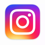
![]() Instagram announced a new logo recently. I’m wondering where all marketers will be scrambling to make the adjustments. After all, instagram has become the hottest platform for marketers which is why many businesses are trying to get a large number of instagram followers.
Instagram announced a new logo recently. I’m wondering where all marketers will be scrambling to make the adjustments. After all, instagram has become the hottest platform for marketers which is why many businesses are trying to get a large number of instagram followers.
Is it shown on any of your printed material? (Hope not!) Do you use a list of social media icons linked to your social media accounts on your website or blog?
If so, are you using the “latest” Instagram logo? Well, better click thru your websites to make sure you’re plugin’s and social media icons are up to date!
Click here for branding information from Instagram Brand Resources.
Here’s how they announced their refreshed logo a couple of days ago. This is how they described it:
Today we’re introducing a new look. You’ll see an updated icon and app design for Instagram. Inspired by the previous app icon, the new one represents a simpler camera and the rainbow lives on in gradient form. You’ll also see updated icons for our other creative apps: Layout, Boomerang and Hyperlapse.
We’ve made improvements to how the Instagram app looks on the inside as well. The simpler design puts more focus on your photos and videos without changing how you navigate the app.
The Instagram community has evolved over the past five years from a place to share filtered photos to so much more — a global community of interests sharing more than 80 million photos and videos every day. Our updated look reflects how vibrant and diverse your storytelling has become.
I’ve seen a few very short videos on Imgur that make fun of the changes… I guess there are always folks that love to make fun of any changes. Here is the “official” video on an account called Instagram on Vimeo makes the change look a bit more complicated.
Instagram Launches a New Logo With Simple Icon over Rainbow Colors
And I believe that this post explains a lot of the thought process that went into the new logo.
