
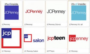
 JCPenney: 4 Logo revisions in 4 years. Yikes!
I am a firm believer in refreshing your company logo periodically. For example, here are few logo refresh and update posts:
- Fast Food Logo Refresh
- Superman logo revisions thru the years
- University of California logo refresh
- eBay logo refresh.
But 4 changes in 4 years makes even the in house graphic designers question which logo to use, which style guide to refer to and I hate to think what the manufacturers and vendors who work with J.C. Penney (or should it be jcpenney?) are doing.
Sometimes a logo refresh also signals a new positioning of the brand. Rebranding or shifting the mindset of the potential user and current customers of a brand. This can be difficult and expensive… but minor updates, well thought out and executed can quietly reinforce the brand, maintaining loyal customers and inviting potential customers.
In recent years JCPenney has been through many changes, not just the logo (like CEO changes, promotion direction changes) and so a logo change may be the least of their concerns at this point. Everytime there is a shift in direction, it takes a while for the customers to catch back up.
What are your thoughts about the logo changes? Please leave a comment below.
Looks like J C Penny is striving to find the right mix- and failing. Too bad this once fine brand seems so lost. Leadership from the Board of Directors on down should be revamped.
They have no idea what they’re doing. That is clear.