

Cingular’s little orange guy flys around the AT&T blue stripped world in one of the first commercials in the Rebranding effort.
Thanks to adverlicio.us for the heads up.
Technorati Tags:Rebranding, AT&T, Marketing, Branding, Cingular
Thanks to adverlicio.us for the heads up.
Technorati Tags:Rebranding, AT&T, Marketing, Branding, Cingular
Another marketing buzz word… Maybe branding (stemming from a hot brand on the rear of a steer) is a little crass. But I’m not sure bonding is that much better… it reminds me of bondo on a car, or something expensive for your teeth.
This from Brad Williamson at Small Business Marketing:
This is why I’m pushing for a new marketing movement - A movement that involves accumulating sales via strategies that are less-dependent upon brands, and more dependent on the creation of emotion-filled relationships between products and consumers. Such a relationship can be developed when a product’s nuts and bolts are valued for their true quality, and its personality (brand) is emotionally appealing.
I think it’s still branding, but with another name. The term branding feels like it’s being pushed onto the consumer, but the term bonding implies a loyalty stemming from the consumer. If the brand advertiser is the one seeking the bonding, wouldn’t it remind you more of stalking than bonding.
I really feel the branding and marketing process is one of a courtship, where both sides take a role. Call me naive.
‘
Even when I’m not at work, I can’t stop thinking about marketing and branding. I guess it’s getting in my blood. My son is a senior and has entered into the college application process. So we’ve spent quite a bit of time on various colleges and university websites.
As a branding professional, I see tremendous branding opportunities in the way many of the college websites are handled. Poor navigation. Clutter. Conflicting information.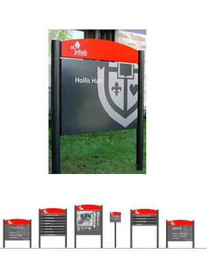 Some sites feel like they’ve been added to and tacked on and grown organically without any rhyme or reason. It is easy to criticize what is obviously wrong. It’s harder to find good examples of what to do right.
As an example of what I consider good work in branding a university, here is BrandLogic’s case study from St. Johns University. They did a nice job of cleaning up the clutter and focusing on brand. Visually it is clean, focused, good use of color.
But, like any good branding campaign, it didn’t begin with the visual, it began with the strategy. A focus on the customer… the target… the who. In the case of new admissions: it’s a primary target market of three: the parents, students, and high school guidance offices.
Also like most branding campaigns, the visual graphics are the most noticeable, but I believe it’s the strategy behind the clean visuals that really drives the impact home:
Brandlogic did a great job of showing what they did for the university, including an outstanding style guide… and after I dug deeper on their site, I found a very sophisticated, well developed process for developing brands and implementation across all areas of marketing: Lots of tools, repeatable processes and logical system for developing a brand and implementing the strategy.
Well done!
Related Post:
Too many stakeholders: Rebranding a University
Tags: Marketing Branding University Branding Brand Strategy Rebranding Style Guide