Marketing with a Landing Page to Build a Prospect List

Are you trying to build a strong potential client or prospect list? One way to do it is with a landing page that persuades your target audience to provide contact information. To do that, you have to keep it focused and offer something of value for free.

You can see an example at www.getdonors.com, a landing page targeting fund-raising professionals.

This landing page has a simple headline the focuses on the offer, a subhead that focuses on the benefits and a video that introduces the teacher and ends with a call to action:

Get Donors Intro from CauseVox on Vimeo used on www.getdonors.com.

The reward for providing your contact info is information for improving your fundraising efforts with 6 video lessons. The landing page uses screen shots from the six short videos to illustrate the reward.

Notice use of color to help direct the call to action?

  • The red burst with the word FREE.
  • The bright blue button that says “Get the free lessons” under the form and under the photos of the lessons.
  • The yellow highlight under the 6 lessons headlines?
  • Light blue arrows “meet your teacher” and “click me”
  • Bright yellow type at the end of the video with the call to action “sign up…”

The page is very clean and uncluttered.  What else do you think would improve this landing page? Leave a comment below. 

 Thanks Kami for the link.


Website Marketing Conversion Tip: That Smiling Face in the Photo May Be Killing Your Conversion

Do you have a friendly face starring out at from your website?  You know, a fresh faced group of young people smiling with a ready to serve you look?

It may be killing your conversion.  Using a photo of a person forces the viewer to look at the person, but does not necessarily help the viewer to click thru to the next step in your sales process.

You would be better served with a button and an arrow that let’s the viewer know what the next step they should take.

Conversion Scientist Brian Massey suggests web designers should induce conversations by:

Use big buttons that call people to action. Draw boxes around important points you want to make. Strike stock photography from the site. Add a video. Shorten your signup form. Add trust symbols and logos to your pages and shopping carts. Most importantly, know the person who typed in the page URL or search term, and why they did so at this point in their life. Then make them glad they did.

Not sure what he’s talking about? Here are 10 examples of what companies are doing right (or could improve on) with landing pages. For example:

  • Change the word on a button from SUBMIT to REGISTER.
  • Use benefit words on your call to action link like LEARN HOW or FIND OUT HOW…
  • Consider using one of these 60 call to action phrase suggestions.

I challenge you to take a look at each of your websites to identify what call to action tweaks you can make to improve conversion.

Share your success —  What change did you make to your site to get more click thru’s? Leave a comment below.

Marketing with InterActive Video: What Do You Want to Learn?

Chris Brown with Cliff Pollan of Visable GainsLast month, when I spoke at the Conversion Conference about using video to increase website conversions, I had coffee with Cliff Pollan from Visable Gains.

He told me how their program allows marketers to ask a simple question inside a video: “What would you like to learn?” and offer users multiple choice answers, while the viewer is still in the video!

This can help viewers move through the sales funnel quickly and even segment by title (CFO, Department Head, Technician) by the choices they make inside the video. I think his interaction program could be a very powerful marketing tool. Continue reading “Marketing with InterActive Video: What Do You Want to Learn?”

Live from the Conversion Conference in San Francisco

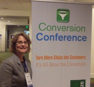
Conversion Conference #convcon Turn More Clicks into CustomersI’m learning a lot at the Conversion Conference. Have met some interesting people and I’ll have some short interviews and info posted here when I have a chance to digest it all. This morning I was a speaker at one of the break-out sessions and co-presented “Easy Ways to Use Video to Improve your Conversions”.

I just finished listening to John Ekman explain how many E-tailers are missing valuable lessons from Retailers. For example, where we put things — the order — makes a big difference.

The conference is in San Francisco and yes, I felt the 4.0 earthquake at 5:30 this morning!

Use Compelling Graphics to Convert Prospects into Clients or Customers

Check out this graphic widget that I just got from the 2012 Conversion Conference organizers.

If you’re working on attracting and converting prospects into clients, you’ll want to take note of the 3 things they did right with this graphic:

  • Bright colors
  • Easy to read words
  • Clear next steps

Notice the title tag that I used when I posted it on this blog? Just hover over the image and you’ll see it. I changed it from the name of the image to title=”Click HERE to Get your Chris Brown speaker discount to the 2012 Conversion Conference in San Francisco.”

I think that this will help people know what the next step is.

Does this give you an idea about how to use a graphic like this on your website or blog? Do your potential clients know what the next step is?